Help Garden
Powered by 🌱Roam GardenPart of Roamcult Themes
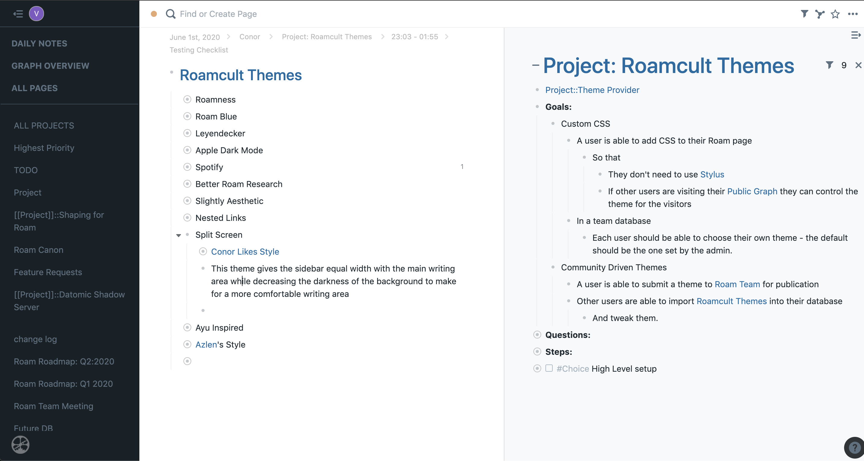
Split Screen
- Designer:: David Crandall
- Twitter:: @davidcrandall_w
- Love this theme? Say thanks via Paypal
- Also created: Right to Left
- Designer:: David Crandall
- Twitter:: @davidcrandall_w
- Love this theme? Say thanks via Paypal
- Also created: u1sct8G39
- Special Features::
- This theme provides support for right to left (RTL) languages like Hebrew and Arabic.
- Code::
- Last updated June 4th, 2020
/* Right to Left CSS for Roam                */
/* "Assembled" and tweaked by @DavidCrandall */
/* https://davidcrandallwrites.com           */


.roam-body .roam-app .roam-sidebar-container {
    right: -232px;
    /* left: 0px; */
}
.roam-body-main .flex-h-box {
    direction: rtl;
}

.roam-sidebar-container {
    direction: rtl;
}

.flex-v-box {
    margin-left: 0px !important;
    margin-right: 20px;
}

.scrollbar {
    margin-left: 0px;
    margin-right: 30px;
    float: right;
}

#home .icons .bp3-icon-large:hover {
    margin-left: 0px;
    margin-right: 60px;
}

#landing-page #cover #tag-line ul {
    margin-right: 32px;
    margin-left: 16px;
}
#landing-page #cover #endorsement {
    margin: 80px 20px 20px;
}
#landing-page #features ul {
    padding-left: 0px;
    padding-right: 16px;
}
.rm-emoji-block-view {
    margin-left: 0px;
    margin-right: 40px;
}

@media (max-width: 500px) {
    .bp3-omnibar {
        max-width: 310px;
        right: calc((100vw - 310px) / 2);
    }
}
.roam-topbar {
    padding-left: 16px;
    padding-right: 16px;
}
.check-container {
    padding-left: 0px;
    padding-right: 12px;
}
/* Create a custom checkbox */
.checkmark {
    right: 0;
}
.rm-title-display {
    direction: rtl;
}
/* Style the checkmark/indicator */
.check-container .checkmark:after {
    right: 3.5px;
}
.rm-find-or-create-wrapper .rm-menu-item .rm-search-list-item {
    margin-left: 0px;
    margin-right: -20px;
}
.rm-pages-sort-menu-item {
    padding-left: 16px;
    padding-right: 16px;
}
.rm-histogram-table {
    margin-right: -8px;
}
#right-sidebar .roam-bullet-closed {
    background-color: #a7b6c2;
}
#mobile-capture li div {
    margin-left: 0px;
    margin-right: 12px;
}
.edited-by-view {
    margin-left: 0px;
    margin-right: 0px;
}
.block-bullet-view {
    margin-left: 0px;
    margin-right: 5px;
}
.block-border-left {
    border-left: 0px;
    border-right: 1px solid #bfccd6;
    /* #bfccd6;*/
}
.text-align-left {
    text-align: right;
}
.text-align-right {
    text-align: right;
}
.controls {
    padding-left: 0px;
    padding-right: 4px;
}
.version-bullet {
    margin-left: 0px;
    margin-right: 0px;
}
.dnd-separator .dnd-drop-bar {
    right: 20px;
}
.tags-input {
    text-align: right;
}
.tags-output {
    margin-left: 0px;
    margin-right: 4px;
}
.tags-output-item2 {
    margin-left: 0px;
    margin-right: 6px;
}
- Special Features::
- This theme gives the sidebar equal width with the main writing area, while decreasing the darkness of the background to make for a more comfortable writing area.
- Code::
Last updated June 4th, 2020
"/* Split Screen CSS for Roam */
/* "Assembled" and tweaked by @DavidCrandall */
/* https://davidcrandallwrites.com */


/* change main font */

body,
html,
div,
textarea {
font-family: -apple-system, BlinkMacSystemFont, sans-serif;
}

/* change font for all headings */

h1,
h1 div,
h1 textarea,
.rm-level1 div,
#right-sidebar .rm-level2, /* page headings in right sidebar */
.rm-reference-main .rm-level3 , /* page headings in referenced items */
.rm-level1 textarea,
.roam-log-preview h1,
h1.rm-title-display,
h1.rm-title-display textarea,
.level1,
.level2 {
--font-family: "Fira Code", Menlo, monospace;
font-family: -apple-system, BlinkMacSystemFont, sans-serif;
font-weight: 500 !important;
--letter-spacing: -0.08em;
}

h2,
h2 div,
h2 textarea,
h3,
h3 div,
h3 textarea {
--font-family: "Fira Code", Menlo, monospace;
font-family: -apple-system, BlinkMacSystemFont, sans-serif;
color: #333 !important;
}

a {
color: #106ba3;
/* #4f718f; */
}

/* less space below page heading */

.roam-body .roam-app .roam-main .roam-article .rm-title-display {
margin-bottom: 10px;
}


h1.level2 {
font-size: 36px !important;
}

/* Main block - remove centering */

.roam-center {
--align-item: left;
flex-basis: 40% !important;
}


/* lighter bullets */

#right-sidebar .controls .roam-bullet-closed,
.controls .roam-bullet-closed {
background: none;
border: 1px solid silver;
}

.simple-bullet-inner {
opacity: 0.3;
}

/* lighter vertical guides */

.block-border-left {
border-color: #eee;
}


.roam-block-container h1 {
font-weight: 300;
font-size: 26px;
color: black;
}

.roam-block-container h2 {
font-weight: 600;
font-size: 18px;
color: black;
}

/* align checkboxes better */

label.check-container {
margin-bottom: 11px;
margin-right: 3px;
}

/* align checkboxes in zoomed-in headings */

.rm-level1 label.check-container {
margin-bottom: 17px;
margin-right: -3px;
}

/* don't shrink block references */

.rm-block-ref {
font-size: 1em;
padding: 0;
margin: 0;
}

.rm-block-ref label.check-container {
margin-bottom: 12px;
}


/* don't need "SHORTCUTS" heading */

.starred-pages-wrapper .flex-h-box {
display: none;
}

.starred-pages-wrapper \> div:first-child {
margin: 0 -18px;
}

/* more subtle logo */

#roam-sidebar-logo img {
opacity: 0.4;
}
#roam-sidebar-logo span {
display: none;
}

/* fade loading astrolabe */

.loading-astrolabe img {
opacity: 0.2;
}

/* lighter sidebar background */

#right-sidebar {
background-color: rgba(216, 225, 232, 0.2) !important;
/* rgba(216, 225, 232, 0.3) */
border-left: 1px solid #ddd !important;
}

/* sidebar sections */

#roam-right-sidebar-content \> div {
border-bottom: 1px solid #ddd !important;
margin: 0 !important;
padding: 10px 4px 10px 50px;
}

/* sidebar section headings */

#roam-right-sidebar-content \> div \> div:first-child {
margin-left: -10px;
}

/* rule under top section of left sidebar */

.roam-sidebar-content \> div:first-child {
padding: 4px 16px !important;
margin-bottom: 8px;
border-bottom: 1px solid rgb(57, 75, 89);
}

/* rule under topbar */

.roam-topbar {
border-bottom: 1px solid #eee;
}

/* crumbs */

.rm-reference-item
\> div:first-child
\> div:first-child
div
span:not(.bp3-icon-chevron-right),
.roam-article
\> div:first-child:not(.roam-log-container)
\> div:first-child
div
span:not(.bp3-icon-chevron-right) {
font-size: 12px;
line-height: 1.3;
color: #bbb !important;
/* truncate to smaller width, use css for ellipsis */
--max-width: 1000px;
white-space: nowrap;
overflow: hidden;
text-overflow: ellipsis;
padding: 2px !important;
}

.rm-reference-item
\> div:first-child
\> div:first-child
div
span:hover:not(.bp3-icon-chevron-right),
.roam-article
\> div:first-child:not(.roam-log-container)
\> div:first-child
div
span:hover:not(.bp3-icon-chevron-right) {
color: black !important;
}

/* chevrons in crumbs */

.roam-reference-item \> div \> div:first-child .bp3-icon-chevron-right,
.roam-article
\> div
\> div:first-child:not(.roam-log-container)
.bp3-icon-chevron-right {
font-size: 1em;
margin: 0 3px;
color: #ddd !important;
}

/* no checkboxes in crumbs */

.roam-reference-item
\> div:first-child:not(.roam-log-container)
\> div:first-child
label.check-container,
.roam-article
\> div:first-child:not(.roam-log-container)
\> div:first-child
label.check-container {
display: none;
}

/* link buttons for referenced items */

.rm-reference-main button {
border: 1px solid #eee;
border-radius: 0.3em;
font-size: 0.8em;
}

.rm-reference-main button:hover {
border-color: #ccc;
}

/* referenced item section headings */

.rm-reference-main {
--border-top: 1px solid #ededed;
}

.flex-h-box {
padding-top: 0px !important;
}

.rm-reference-main .flex-h-box {
min-height: 30px;
}

.rm-reference-main strong {
color: #666;
font-size: 0.8em;
--background-color: rgba(216, 225, 232, 0.3);
}

/* remove background from referenced items */

.rm-reference-item {
padding: 6px 0 0 0;
margin: 6px 0 0 0;
border-top: 1px solid #eee;
background: none;
}

/* slightly bigger page headings under referenced items */
.rm-reference-main .rm-level3 {
font-size: 1.6em;
}

/* search */

.rm-find-or-create-wrapper {
flex: 0 1 100% !important;
}

.rm-find-or-create-wrapper .bp3-input {
border: none !important;
box-shadow: none !important;
}

/* highlights */

.roam-highlight {
--background-color: #c2f9fa;
}

/* links */

a.rm-alias.rm-alias-external {
color: #b33ba9 !important;
}

.rm-page-ref-link-color {
color: #106ba3;
}